
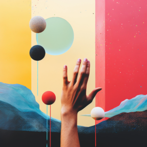
Colors are elements of infinite importance in every aspect of our lives. We cannot imagine a world without colors. They relax us, make us happy, and sometimes even make us uneasy. Colors also have emotions, meanings, and energies. Have you ever considered what colors, which are so important in our lives and whose effects are directly proportional to their importance, mean for your brand? Colors have a specific psychology and impact for marketing.
What is included in this content?
Marketing and Branding: The Psychology of Colors

Factors such as the extent to which a particular color has an impact, what it evokes in a person, and what it brings to mind, influence consumers in many ways, from attracting attention to a brand to making a purchase. Colors that convey different messages help consumers form certain ideas about the brand in their minds. The correct and effective use of colors has both marketing It also positively influences the position of brands in the eyes of consumers during branding processes.

RED
It is the color that the human eye perceives best, notices most quickly, and whose effect is seen most rapidly. Because it evokes a sense of urgency, it has a strong motivating effect on the customer to buy the product/service. It is a color that triggers both positive and negative emotions. Therefore, it should be used carefully. Because it symbolizes speed and passion, it is frequently used in the automotive and lingerie industries. At the same time, it can also trigger negative emotions such as anger, danger, warning, and pain.
BLUE
It evokes trust. Pay attention to companies where trust is highly valued, such as banking and healthcare; many use the color blue. Besides its calming effect, it also symbolizes strength and wisdom. It is among the colors frequently used by the banking sector.
YELLOW
Yellow, the color of energy, sincerity, and warmth, also evokes concepts of strength, vitality, and discipline. It triggers enthusiasm and happiness, and positively influences efficiency and productivity. When used with dark and contrasting colors... to deliver an effective message It is ideal for.
PURPLE
Purple, the color of ambition and nobility, also supports creativity and inspires. Symbolizing wealth and royalty, purple is the color of prestigious brands. It has a positive effect on being assertive and reflecting qualities that others don't possess. It also represents spirituality and creativity.
GREEN
Green, the color of peace and freshness, is widely used in the food industry. It evokes a feeling of freshness and naturalness in consumers, contributing to a positive purchasing decision.
PINK
Pink, representing love, empathy, and nurturing, has a calming effect. It is a color frequently used by brands targeting women.
WHITE
White, representing simplicity, purity, and innocence, also symbolizes composure, stability, and continuity. It has an effect that enhances thinking power.
BLACK
Black, the color of authority, mystery, and power, is also an effective color widely used in the digital and technology sectors because it represents solidity and quality. As the color of luxury, black is a particularly suitable choice for fashion-related industries.
THE PSYCHOLOGY OF COLORS IN DESIGN
Above, I discussed the meanings and connotations of colors commonly used in many sectors. But have you ever considered the importance of colors in the work you want to do for your company/brand? In fact, your target audience plays a significant role in the use of colors. The relationship between your target audience and colors... digital agency Alternatively, carefully working with someone in your organization who is proficient in this role will be an important step for your brand.
When people visit your website, check your social media, or use your mobile app, what kind of reaction do you want them to have? What emotion do you want to evoke in them, how do you want to leave a lasting impression on them, and what level of brand retention do you want?
Using colors that inspire trust, excitement, and curiosity about your brand, without boring users, will be to your advantage. Using colors that tire the eyes, don't contribute to brand memorability, and become tiresome after a while will have a negative impact. Instead, you can positively influence your target audience by using colors that stimulate the mind and create positive effects, even incorporating combinations of contrasting colors.
To stay informed about the digital agenda. Istcode Blog‘You can follow 'u'!


E-commerce website design is the most critical step in converting a visitor into a customer. If you create the right flow, the shopping cart will grow. We don't just design beautifully…

Our clients frequently ask, "What is Next.js and what is it used for?" This is because the choice of technology directly impacts speed and SEO results.
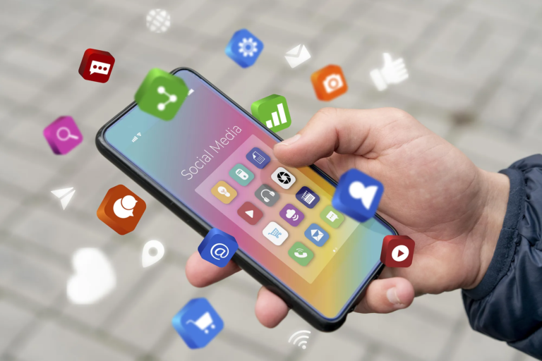
Social media is a digital platform where people from all over the world can communicate and share their interests, hobbies, and passions. It allows people to connect with each other in real life…

Digital advertising types accelerate brands' online growth. First, you capture the target audience. Then, you show the right message. And you control the budget. This...

LinkedIn ads are a powerful solution, especially for brands looking to reach decision-makers directly in B2B marketing. This guide will explain the concept of LinkedIn ads…

The digital world is changing rapidly. The 2023 digital marketing trends are opening up brand new opportunities for both brands and users in this transformation….